Monday, 19 May 2014

Dan Boulton

Born in 1973 in Enfield, London Dan Bolton was a photographer. The type of photography he did was street and  documentary. Skateboarders being a main focus. A collection of his work was published as a limited edition book. Working alongside Ed Templeton, Dave Schubert and Tobin Yelland in the 'Film Por Vida' show created by Angela Boatwright. Running at London's Wayward Gallery in June this year (2014) Using a Leica M6, a 50mm f/2 and Liford HP5 film.
Choosing a urban black and white art style, the pictures work well with the whole "youths on skateboards" theme.


In this image it shows two young skaters in a skate park, as you can see from the artwork behind them. It's out of focus giving it a slight style, it was made like this on purpose. Maybe to show movement, of a skater? The style fits the skater life, it really shows the darkness and the roughness of skaters.

This image is more of a portrait sort of image, it really shows personality. It shows off someone in the skater community and the black and white colours make him stand out. It gives the image a tiny essence of depression.

Another image using a moving theme, it shows more movement in the image. It creates a sense of a faster theme. The dog shows a rebelling theme in this image, and the black and white keeps it nice and fresh.

Question for Dan Boulton:
Do you skate, who inspired you to start being a photographer?


Final poster/dvd

Finished Poster/DVD
So here they are at the end of everything, all the images edited together to create my poster/DVD. And I think they fit perfectly in the way I used them. I feel like the mug looks like it's actually there, it doesn't look edited in. It looks comply natural. I feel like all the colours fit well together and it made my poster/DVD look indie. Which after everything is what I wanted.


Photography Evaluation Write-up (desk)

This picture is one of the most important images of my whole project, as its the background for the poster. I needed it to also be simple, to fit the environment of a mug. The shot type I used was a long shot of the desk, showing the windows in the back. I needed the windows to be out of the depth of field   so everything would look more realistic.

I never saved the main image I chose (I only saved after I edited) The reason I selected this photograph was because the lighting off the desk, and how clear everything in the image is. The background (through the windows) was perfect for what I wanted to do.


So, I used the image rotation tool to rotate the image into a portrait image (fitting poster conventions) Then I cropped the image to create a more centre piece, then in the background I made the outside red (recently removed) to try and create an evil feeling in this shot. I also boosted up the colours in colour correction.
Finally the finished picture, I really liked how it turned out. It was completely natural and fitted the piece so much. I loved the lighting, the background is so colourful and the final quality is really smooth and visually it's what I wanted!


Photography Evaluation Write-up (More characters)

For this I wanted it to be very balanced and in all honesty a simple picture. I wanted to show off the themes for the movie more than creating a crazy image. Obviously I wanted it too look good, but it was more about where I was placing the characters. I wanted them dead centre giving them power in the image. I used the depth of field to make the characters stand out a little, while keeping the background in a blurry state.


I used this one in the end as it looked the best out of the bunch, keeping both characters to each side of the shots. I liked that in the end as it gives the image more of a filled style, instead of having two plain sides. It keeps this image focused, I also liked the colours in this keeping mostly boring.


I used the contrast tool to turn the brightness and contrast down, making the colours more gritty and dirty. I then cropped it just a little to make it look less wide, and framed it better to keep it clean. I also kept to the rule of thirds and made the characters fit into each section. 


In all honesty I didn't like this photograph in the end, I felt like it wasn't as nicely shot as everything else on my dvd/poster covers. But I liked the gritty feeling of this image, it is good quality and the lighting is nice. But something doesn't work...

Photography Evaluation Write-up (Character)

I wanted an image that would create a sense of the cinematography for this "film" as you can see with the image I picked I used one with a big depth of field. The background is blurred out with the focus on the character. Some images were not picked because the acting in the images was a bit off focus. Also some were not used because the depth of field was not good. Also sun flair got in the way! The shot type I used in the end was a close up, to show off the characters personality and expressions.

I selected this photo in the end as it showed off what I wanted all along. It kept the depth of focus the way I wanted it, with the character in focus in the fore-ground and the college out of focus in the background. Keeping the personality of the character booming out! I also liked the colour in this image a lot, it has a lot of green, making it a bright image. This was suitable for my film/dvd as it looks very different and interesting (indie).

Firstly I used the colour corrector to change the colours up a bit, making it a more vibrant shot. Then I used the crop item, and cut off the sides a little bit. Making the rule of thirds work better with this image. I also turned the contrast down a tiny bit.


I am really proud of how this came out in the end, it came out really high quality with good lighting. I am impressed with the style I chose in this picture.


Photography Evaluation Write-up (mug)

Firstly I wanted to use a whole image on this mug as it keeps it in focus, showing off every detail. I wanted it to be in a shadow to keep it looking realistic in the final image. I kept a huge focus on the angle I took the picture at, as this was important in the final image. I also kept in mind the size of the mug, making sure it wasn't too over the top. It needed to look like a mug after all!

I wanted to frame it in a close and important way, basically it was the most important thing in this whole shot. I needed perfect lighting on these images, it needed to look completely natural and unedited in this shoot. In the end I picked a medium shot of the mug, keeping some desk in (edited out in the final image) I made sure the mug was completely in focus, using a depth of field that made the mug stand out as much as it could.

Here is the original photograph (only the mug, as I lost the final image) but it fulfilled the purpose as it's exactly what I needed. A mug. It's at a perfect angle to use in my final image, the lighting on it really keeps it real. The colours are very natural and all in all it is a very detailed picture of a mug.
This picture is suitable for my poster/dvd box because it's the most important thing, this one image of a mug is what I want people to focus on, it keeps things simple (like I wanted) it's also what I wanted to make my film feel a little bit "indie".

As I lost the main image here is the edited one again, I used the cut tool to cut around the mug in the image. Using crop to make the image smaller first, then correcting the colour slightly to make the mugs colours look more natural. Then I carefully cut around it, and then I blurred the rough outlines to make it more smooth (creating a natural feeling and look).
I'm really happy with the finished photograph as it has kept it's high quality texture and remained as simple as I want it, it looks like a normal mug. Which is really nice, the lighting really brings it out with the texture shine it makes it look smooth and real!


Friday, 21 March 2014

Terry Richardson (blog post 4)


Terry Richardson:
Born in New York City, Richardson the son of Norma Kessler, an actress, and Bob Richardson, a fashion photographer. Who struggled with schizophrenia and drug abuse. Raised in Holly wood he attended Nordhoff High School. Deemed in "lacking social skills" he was shy. He played bass quitar in the punk rock band The Invisible Government for six years. He began photography in high school.
Shooting campaigns for Marc Jacobs, Aldo, Supreme, Tom Ford, and Yves Saint Laurent among many others. DOing work for magazines such as Rolling Stone, CQ, Vogue, Anity Fair, Harper's Bazaar, i-D, and Vice.
He has produced several campaigns for Diesel, including the 'Global Warming Ready' which won a silver lion for print at Cannes Lions International Advertising Festival in 2007.
There are several repeating themes in Richardsons work, putting high-profile celebrities in mudane situations and photographing them using traditionally pedestrian methods, such as the use of an instant camera. Exploring the ideas of sexuality, many of his pieces include full-frontal nudity and both simulated and actual sexual acts.He used white backdrops before and he started to expand to more interesting back drops. 


Miley Cyrus at Terry Richardson 's studio
This picture is a common picture among most of Terry Ritchardson's work. He likes to create pictures of famous people acting like him, using his iconic glasses. In this image he uses Miley Cyrus to portray himself, as she is the "hype" at the moment.

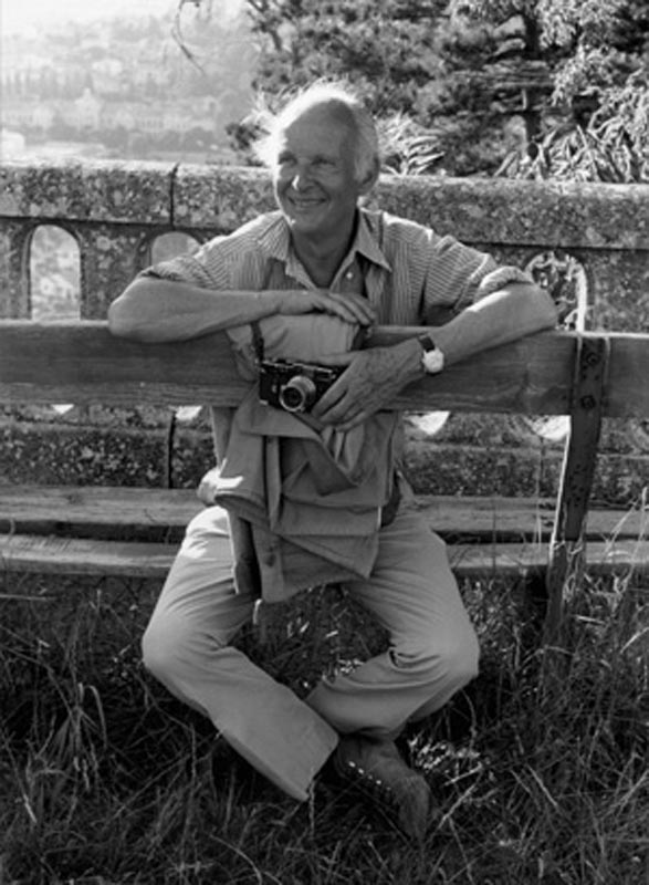
Terry Richardson-Photographer
This shows off the style of Terry Richardson's work as someone else is playing him in this image as well. Using a bland backdrop as in this image also shows the style of his work.

Barack Obama-Terry Richardson
Another picture showing off his main type of work, most of his work is very simple but put together well. This time the person in the image (Barack Obama) is not playing as Terry Richardson, he is just playing himself.


Picture 1: http://www.highsnobiety.com/files/2013/08/terry-richardson-miley-cyrus-01.jpg
Picture 2: http://bloginhellbecky.files.wordpress.com/2013/04/terry_richardson_chloe_sevigny_06.jpg?w=1118
Picture 3: http://www.highsnobiety.com/files/2012/11/barack-obama-terry-richardson-3.jpg


Sunday, 23 February 2014

Henri Cartier-Bresson

Born in 1908 and recently died in 2004 Henri Cartier-Bresson was a French photographer who was known for being the father of modern photojournalism.Being an early adopter of the 35mm format and a master
of candid photography. He influenced a generation with his "street photography" style.
In the early years he was trained to be a painter but started his career in photography in 1931 on a trip to the Ivory coast. Being one of the first photographers to use a Leica camera in a 35mm format.


Never using flash Henri saw it as "impolite…like coming to a concert with a pistol in your hand." Not using a dark room Henri believed in composing his photographers in the viewfinder . In most his photograph's he had them full screen, free of cropping. El naturall!


                                         Henri Cartier-Bresson
                                         Lorraine, France, 1959
                                         11 x 14" silver print, pr. later

                                      http://www.laurencemillergallery.com/Images/levitt_sbs28.jpg
                                                        Helen Levitt
                                                        New York, c.1942
                                                        14 x 11" silver print, pr. later
                                   http://www.laurencemillergallery.com/Images/levitt_sbs31.jpg
                                                       Helen Levitt
                                                       New York, c.1938
                                                       14 x 11" silver print, pr. later

Urls used: 

Gregory Crewdson

Born in Brooklyn(New York) Gregory Crewdson went to John Dewey High School.
Graduating Early he started a band called The Speedies.He studied photography at at SUNY Purchase (1980s) , and recieved a Master of Fine Art. He taught at many universities including Yale.


Using a unique style of photography Gregory Crewdson using very interesting imagery to create a scene. He uses main sets in his photos in small towns across America and creates very dramatic and cinematic scenes. Featuring disturbing or surreal images. All his photos have very high budgets and can take weeks to get the perfect shot. He doesn't even capture the image himself, he just sets everything up! He was known for liking the styles used by Stephen Spielberg, and the documentary style used by William Eggleston. When creating a scene he uses incredible depth. Like in this image:

This image is called "In a Lonely Place" I find this image to stand out from all the others as its the most simple, yet it's a joy to my eyes. I love the way the colours are used to create attention where it's needed. It also introduces contrast, creating a nice (surreal) image. It also shows his set design, as this will be set up just for this shot!

Untitled, 1998 
C-print, Diasec
135,5 x 152,4 cm
Courtesy the artist; DZ Bank Kunstsammlung; Luhring Augustine, New York
© Gregory Crewdson  
I really like this image, it's when normal meets bizzar. It's completely different from anything I have seen before. 

URLS USED:
http://en.wikipedia.org/wiki/Gregory_Crewdson
http://www.vam.ac.uk/content/articles/p/gregory-crewson/

Thursday, 13 February 2014

Narrative photography


Narrative photography is the idea that photographs can be used to tell a story. Allen Feldman stated that "the event is not what happens. The event is that which can be narrated". In this case, the medium is photography.
The Narrative Photography Competition in Portland, Orgen describes the concept in the following way: "The power of narrative, or story telling is at the foundation of much of photography. Photograhers (sic) are creating complex and descriptive moments in time. Contemporary photographers are crafting and documenting new forms of a visual short story."

mitra-canal-1.jpgPhotographs that capture staged or artificially constructed scenes made only for the purpose of photography. While this type of image-making became well-known in the 1980s through the work of artists such as Cindy Sherman and Jeff Wall, staged compositions—which have alternatively been called “tableau photographs”—have been created since the beginnings of photography. For example, 19th-century photographers such as Oscar Gustav Rejlander and Henry Peach Robinson staged classical or biblical scenes with actors. Also, some of the major inspirations for 1980s staged photographic imagery were 1920s and '30s staged portraits created by Marcel Dunchman and Claude Cahun.

http://photoparley.files.wordpress.com/2012/10/mitra-canal-1.jpg

I really like this image because the indication is lonliness, like its a place of suffering. Everything is broken down, and smashed. It's like the man is revisiting something dear to him. I love the colours used in this image aswell as it brings life to the image.
M

 Leicestershire, 2012
http://caigriffith.com/wp-content/uploads/2012/09/NewImage7.png

This image is incredibly creative, the boxes in the middle make it the center of attention. It uses a story in a picture as it shows the man with some gas, ready to create fire. Everything looks very realistic with a cartoon look.


http://www.ludimaginary.net/img/conceptuel/cardboard-box-head-box-on-the-move-narrative-photography.jpg
This image is something you would see online, its a very dull and realistic image. I like the editing of the face on the mans head. With all the refelections showing everything in metalic.